B2B Enterprise AI · InsurTech
COMPSCIENCE · 2025 to present
Rebuilding a broker prospecting tool around the prospect, not the document
1,300+ brokers came to look at Risk Navigator. Fewer than 2% got past the first screen.
I designed that first version, instrumented it, and rebuilt it once the funnel showed the entry price was the product's real problem. I am also the first and only designer at CompScience, so this case opens with the full surface area I own before going deep on one tool.
Risk Navigator 2.0. A full risk read from a company name alone, with the loss run offered as an upgrade rather than a gate. Sample data throughout.
One designer, the whole product surface. Here is the honest map before the deep dive.
Being the only designer means the job is not a queue of screens, it is deciding what deserves design time this quarter. The list below is what I have shipped or am running now. It is context, not eight case studies, so skim it and keep going.
Login & invitation redesign
Rebuilt account entry across broker and client contexts so people reach the right workspace without guessing.
Risk Navigator 1.0 → 2.0
The prospecting tool brokers use to size up a company. Designed, instrumented, and rebuilt. The subject of this case.
Broker Portal 2.0 → 2.5
The workspace brokers land in: accounts, claims, submissions, and the path into the tools.
SafetyCenter 1.0 → 2.0
Where a risk signal turns into documentation and a concrete safety action for the customer.
SafetyPulse alerts
Alert patterns that carry enough context to be acted on instead of dismissed.
Product comms & AI video
Submission emails, the 60 second value video, and the launch language around it, produced with AI tooling instead of a vendor cycle.
Account manager persona
The carrier side role nobody had defined, written up as a working persona so product decisions stopped defaulting to the broker.
Insurance ecosystem map
One page that connects broker, insured, underwriter, and claims to our products. Used to onboard product people into an industry they have never worked in.
Design system for AI builders
Tokens, components, and the gaps that accumulated while the product outgrew its first UI. Then the design system left Figma and became a Claude skill, so every builder at the company generates screens from it.
Who is in the room, and where our products sit 9 roles, 3 bands
Scope as of 2026. The rest of this page is one project, told properly.
Give us the loss run and we will give you a report.
Commercial insurance brokers size up a company before they ever pitch it. That work is slow, manual, and mostly guesswork until documents arrive. Risk Navigator was our answer: hand the tool a company's loss run and get an AI generated risk report back.
The MVP shipped in Q4 2025 and I designed it end to end. It was deliberately frictionless in the ways we could see: no login required, a short name and email form, then upload, wait, read. The one thing it did require was the document. Upload first, insight second. On paper that is the right trade, because better inputs make a better report.
After launch the team kept improving the parts we could measure from the inside: processing speed, output consistency, and a broker talk track that aggregated the highlights at the top of the report. The tool got better. The funnel did not move.

The 1.0 entry screen. Three steps, and step one is a file the broker may not have on hand.
Brokers were still deciding whether to give it any input at all.
Nobody complained. They just stopped at the same screen.
We tracked the flow in Mixpanel and piped every submission into a Slack channel, so I could watch real sessions rather than rely on anecdotes. Three months of data told a very specific story, and it was not the one I expected.
Interest was not the problem. Traffic was high for our surfaces and the people who did upload almost all finished, even through processing times long enough to lose them. Then most of them downloaded the report to keep or forward. Every signal past the upload step said the output was worth having. The step itself was where the product died.
Risk Navigator 1.0 funnel, Mixpanel, three months.
Reading it back, the upload step asked for the most and offered the least. A broker on a first visit has not seen the output, does not know if it beats a web search, and is being asked to put a client's claims history into a tool they met ninety seconds ago. The loss run itself usually lives in an email thread or a shared drive, so "go find the file" ends the session even for a willing user.
Change the unit of work from a document to a company.
That reframe carried the redesign. Version one was a document processor with a chat surface on top, so nothing existed until a file did. In version two the thing a broker works on is a prospect, and a prospect starts with a name they already know. The tool now has four stages, and the document only shows up in the second one.
Three principles did most of the work inside that structure.
Search is the only entry point. I removed the upload ingress rather than offering both paths, because a choice between an easy one and a hard one still makes the hard one feel required. The broker confirms the company match before anything generates, so the AI never quietly reports on the wrong business.
A report built from public data has to be honest about what it does not know. Locked sections sit in the flow of the report, next to the full ones, and clicking one opens upload as a modal over the dimmed page. The gap becomes the ask, and the broker never loses their place.
Version one asked brokers to upload their loss runs. Version two tells them what unlocks. Upload is framed by what it unlocks, not by the file it wants.
The same product promise, with the cost moved behind the first result.
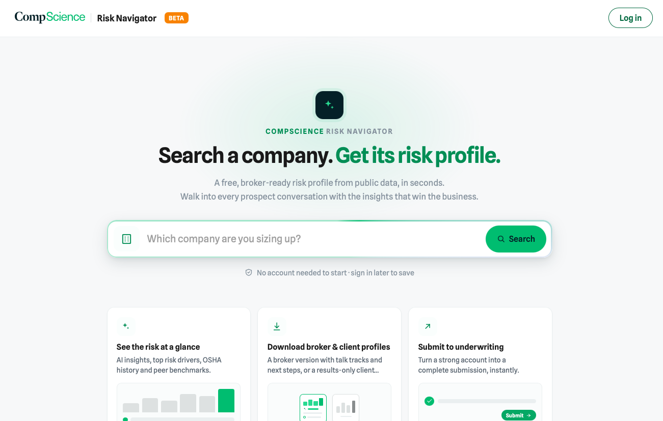
Scout. One input, no account, no document.
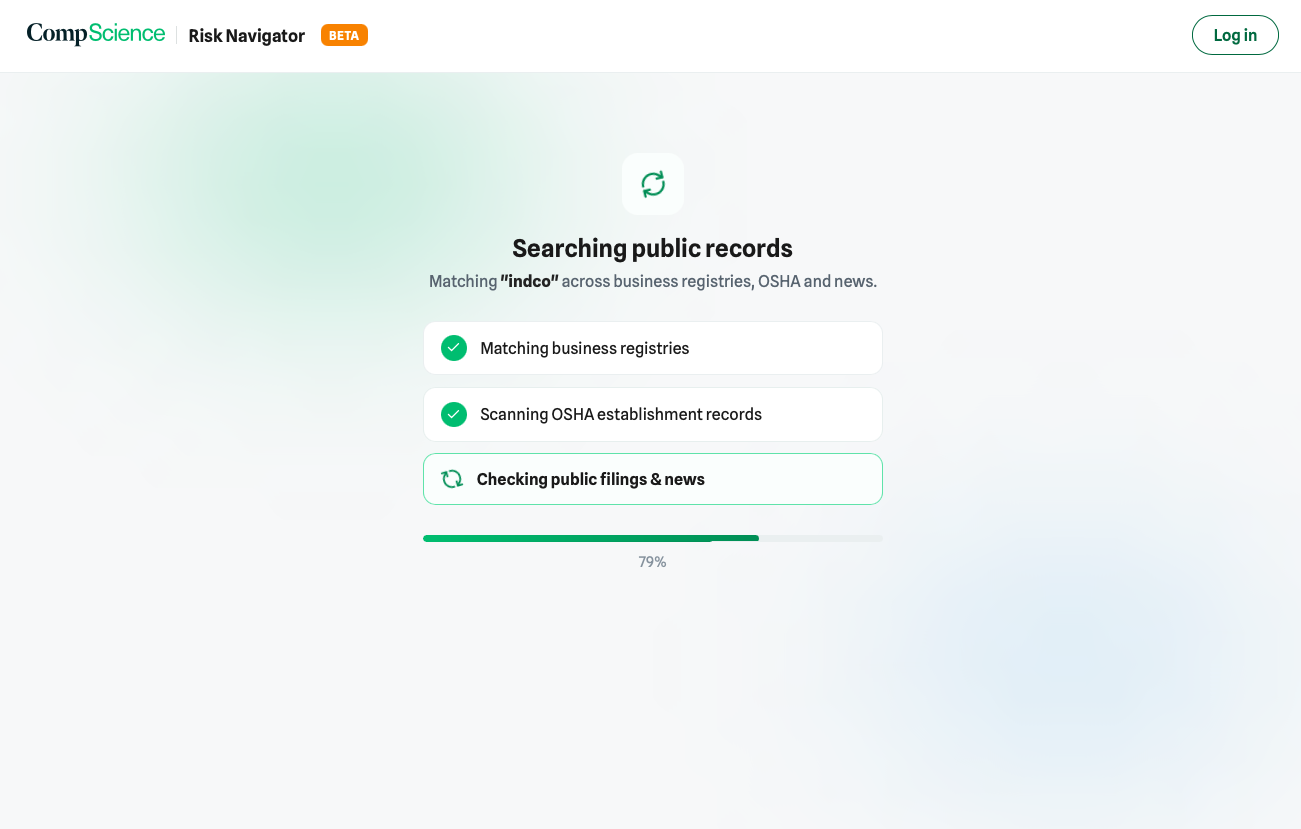
The wait names the work: registries, OSHA records, filings and news.
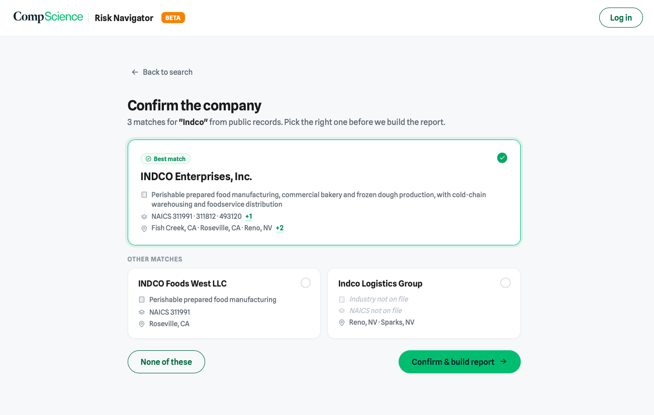
Confirm the match before the report is built. The wrong company is a worse failure than no company.
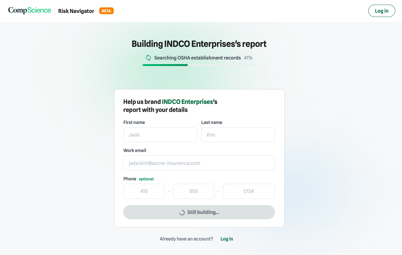
Details are collected while the report builds, so the wait costs the broker nothing.
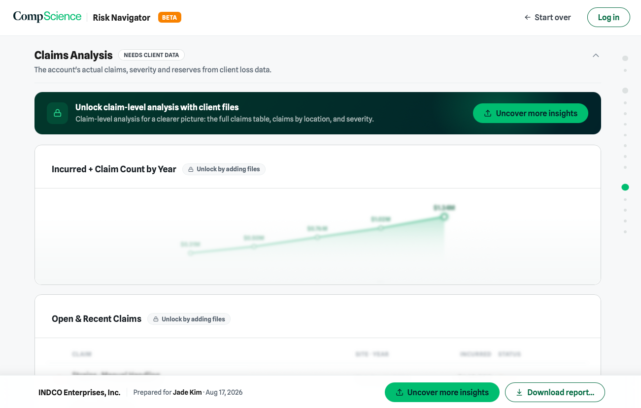
Locked sections sit in the flow of the report. The gap is the ask.
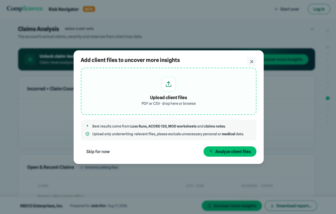
Enrich. A modal over the report the broker is already reading, with skip always available.
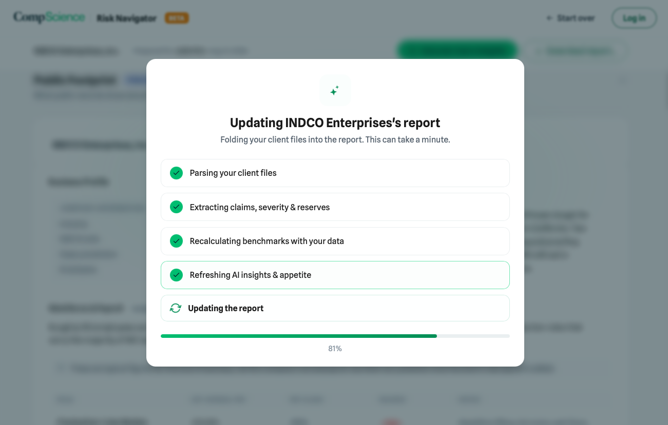
The same report updates in place rather than starting over.
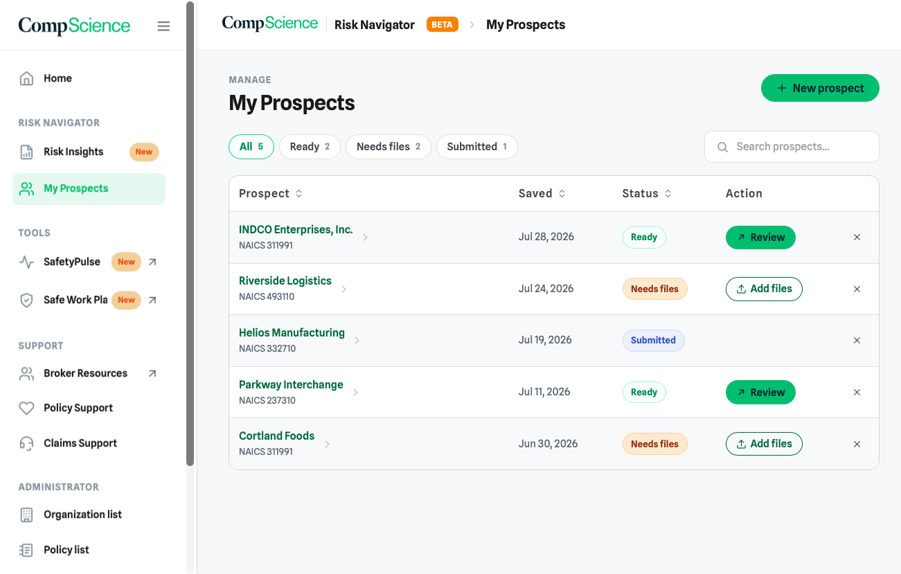
Manage. Ready, needs files, submitted. The pipeline a broker actually thinks in.
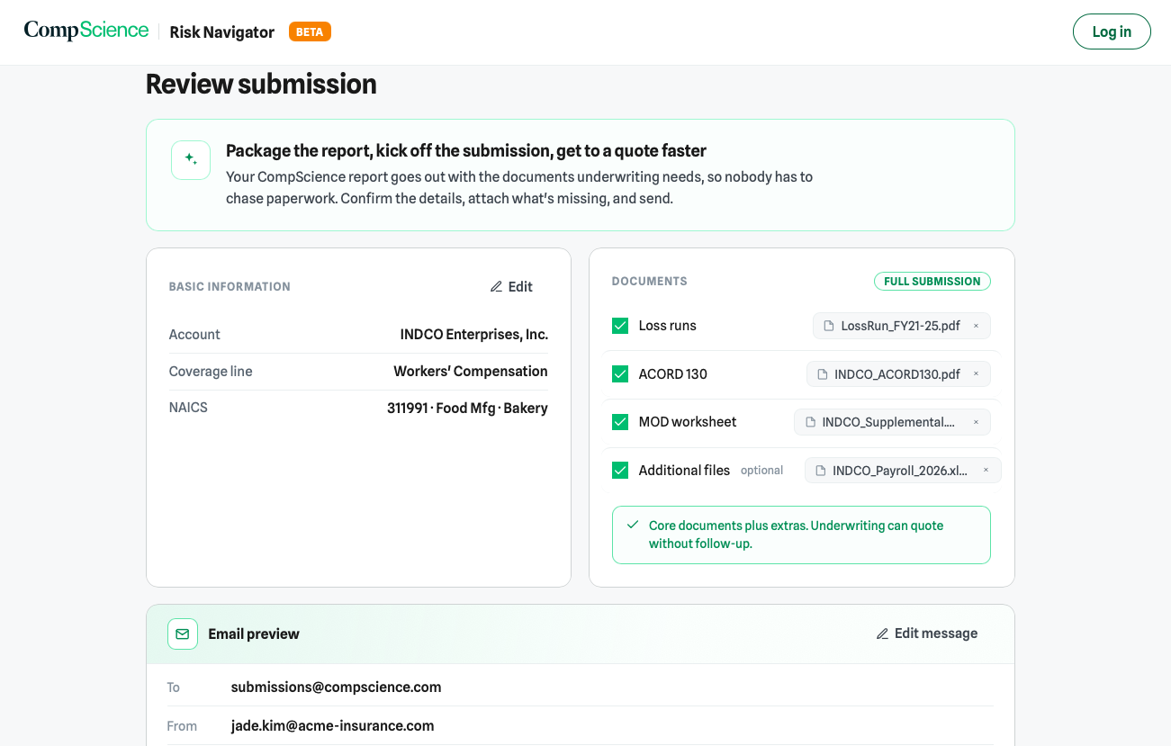
Share. Nothing leaves Risk Navigator until the broker can see exactly what is being sent.
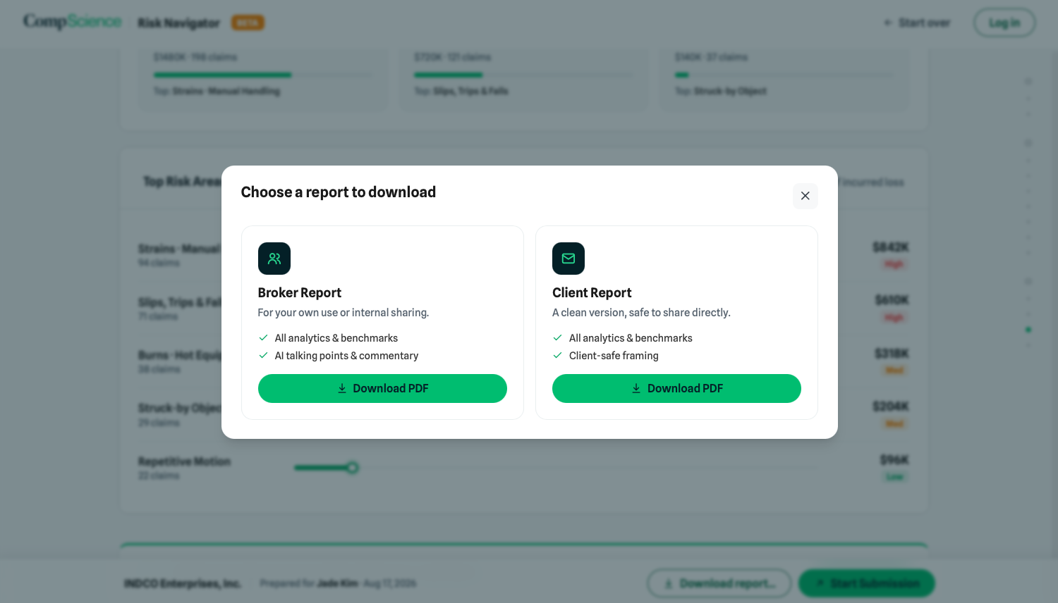
Two PDFs, not one: a broker version with talking points, and a client safe version to send straight on.
A rebuild is also a chance to overcorrect, so I was specific about what not to touch.
- +Public research became the entire basis of the free report: appetite against our own underwriting criteria, OSHA and BLS signals, peer benchmarks, web intelligence with visible sources.
- +An account model appeared where there was none, because a saved prospect list only means something if the product knows who you are. The login wall is deliberately late and soft.
- ·AI Insights kept its place at the top of the report. Brokers told us these are what they take into a client meeting.
- ·Claim insights from an uploaded loss run stayed intact, and became the payoff for enriching.
- ·The broker talk track stayed too, folded into the same insight component as a tab rather than a separate block. Same value, one less thing to learn.
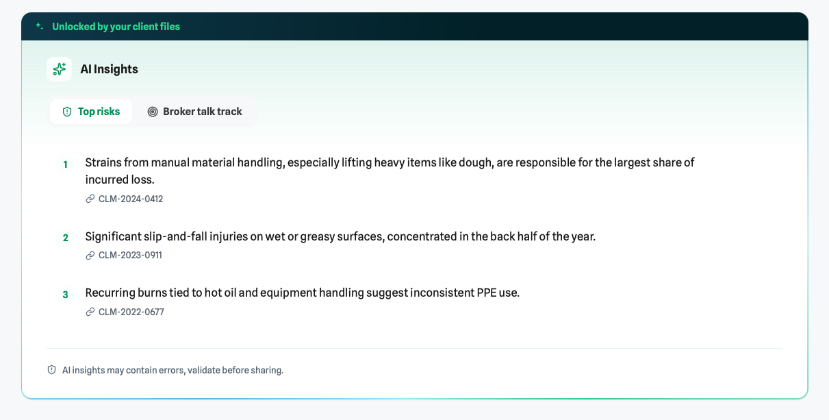
Kept. AI Insights and the broker talk track, now one component with tabs and a feedback control.
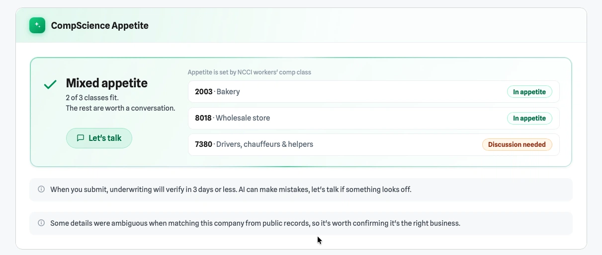
New. Appetite fit stated plainly, class by class, so a broker knows whether to invest the call.


Kept. Claim level analysis from the loss run, unchanged in substance and re ranked for scanning.
Between 1.0 and 2.0 I stopped handing over frames and started handing over working prototypes.
Version one was a Figma handoff: screens, redlines, a spec doc, and a lot of conversation to cover the states the file did not contain. For version two I designed in code with Claude, which changed what a handoff can even be. The prototype the team received was clickable, used the real component library, and carried its own documentation.
Every data bound element in the prototype is annotated with the backend field it comes from. Pressing S toggles an inspect overlay that draws those field names directly on the UI, so an engineer can read the schema to interface mapping on the screen instead of cross referencing a table. It also caught our own gaps: fields the design assumed existed and the API did not return.
Instead of describing edge cases in prose, I built every state the report has to survive as a real page: no match, insufficient public data, partial upload, in appetite, out of appetite, mixed appetite, loading, empty. Rendered with the same components, so there is nothing to interpret.
The FAQ rewrite went out as a before and after page the team could read side by side and react to, with the reasoning for each change attached. Same for three visual directions of the results dashboard. When the artifact is cheap to make, you can ask for a decision instead of assuming one.


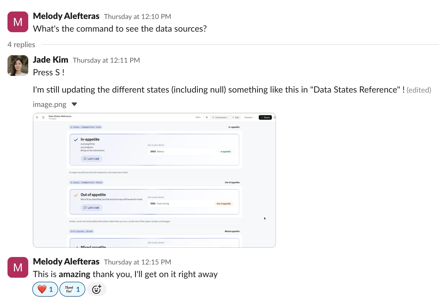
It got used the way I hoped: an engineer mid build, asking where a value comes from, and answering it from the prototype instead of waiting on me.